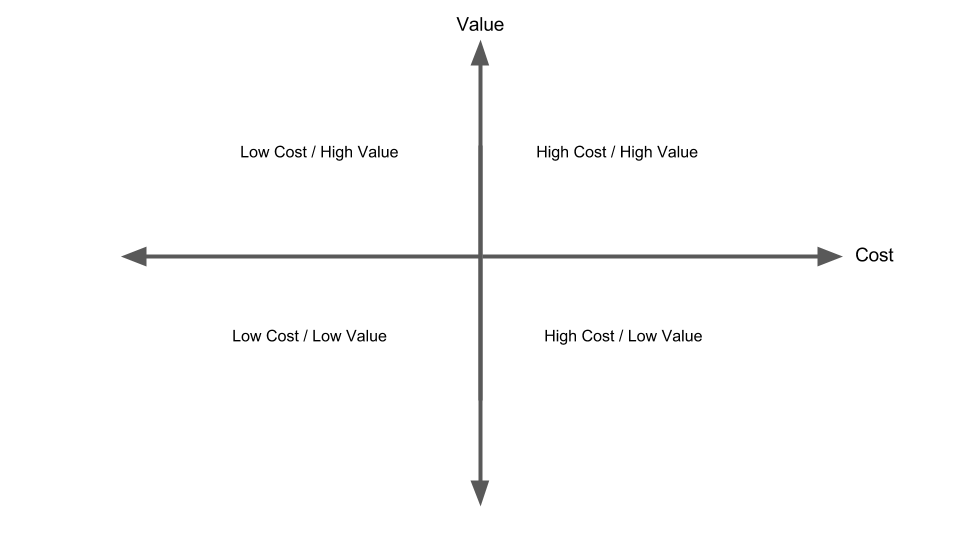
Almost everyday during software development we constantly find ourselves asking if a story, feature, functionality and/or fix is worth doing. A diagram that helps facilitate this conversation is the Value versus Cost diagram.
It is a simple diagram that can be used whenever a decision needs to be made. On one axis we depict Value, from High to Low. On the other axis we depict Cost, from High to Low. Items that are Low Cost/High Value should be done immediately, items that are High Cost/Low Value, are items that we can probably avoid for now.
Over time this diagram has proved to be extremely valuable as it helps teams understand the different trade offs that need to be weighed up before committing to something. Plotting items on this diagram as a team also helps the team reach a shared understanding of why some items need to be done or why some items can be avoided.
One thing to note is that items can move over time. Some items will have their cost reduced and some items will have their value increased. This is normal. It can also help to ask, "If we wait a few more iterations, will it become cheaper to do XYZ?" or "XYZ isn't very valuable now, perhaps it's value will increase, once it's value increases, perhaps then it will make more sense to wear this high cost?".
